KIOSK UI
"We need a consistent visual customer experience and with the brand refresh we need to update the kiosk UI. I think we can improve the usability for customers while we are at it."
Coinstar launched a brand refresh and marketing study. We used the refresh initiative to discover customer needs and challenges.


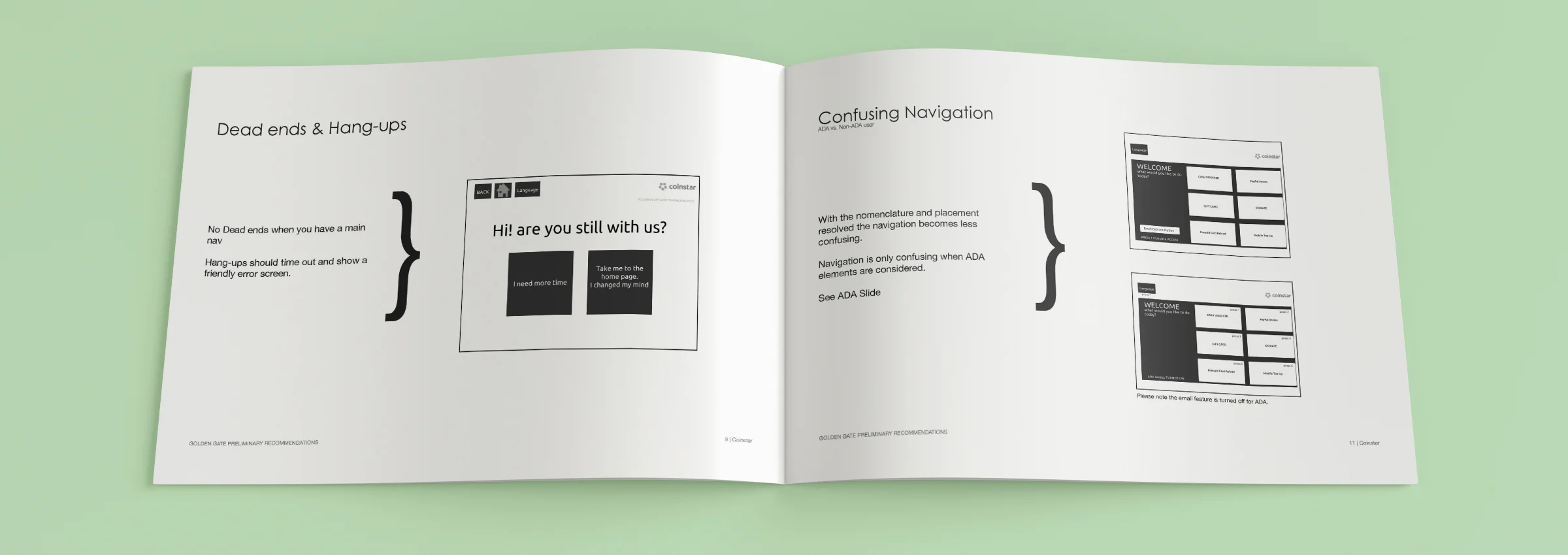
Dead-ends in the flow, inconsistent UI design systems and button placements left customers confused and unable to complete some transaction types, according to the independent UX study.
Using UX research, heuristics, and usage data I began to put best practices in place to remedy customer issues.


Customers use the Coinstar kiosk to perform various transaction: convert coins to cash, coins to gift card (no fee), withdraw cash from PayPal, send money with PayPal, or add cash to a PayPal account. The PayPal and gift card flows were identified as being the most difficult for users.

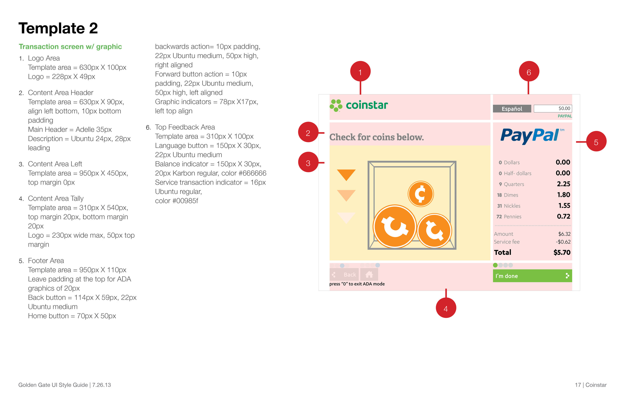
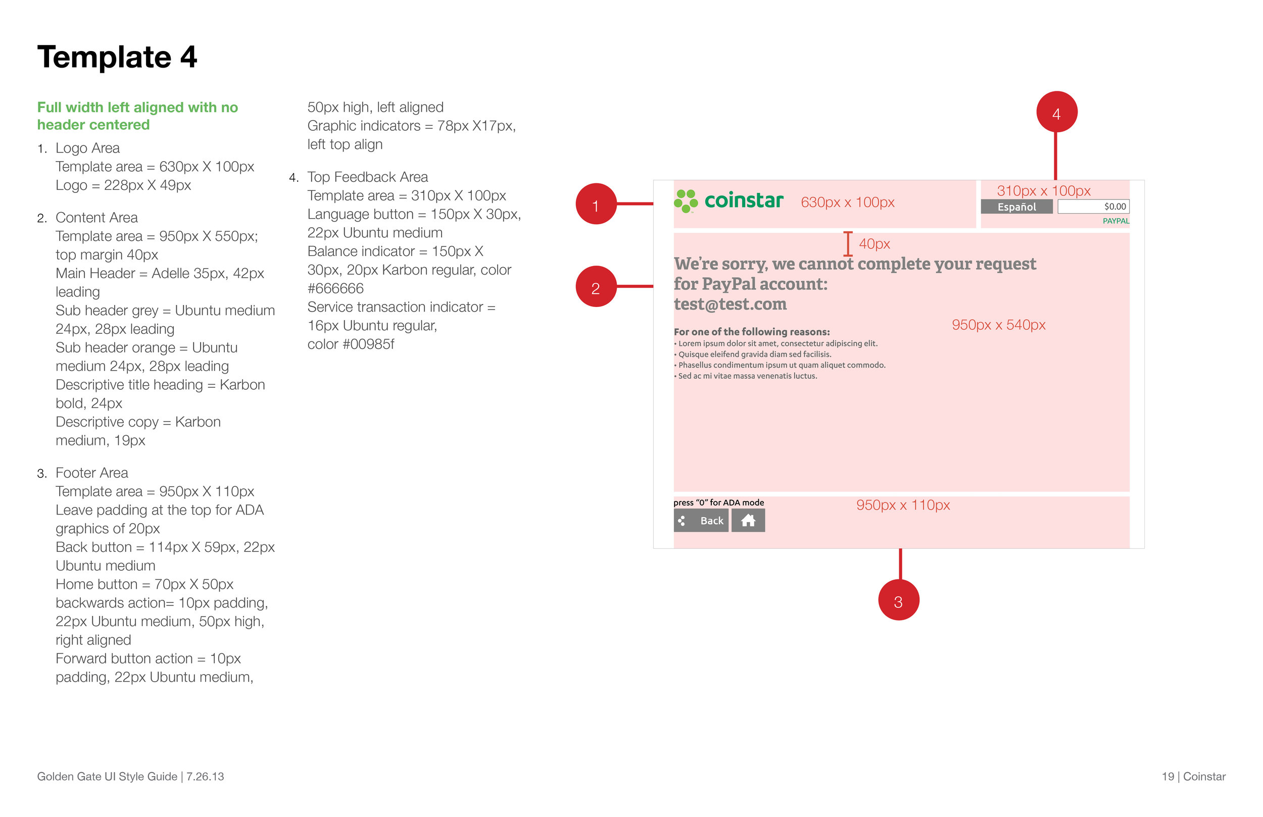
Technical teams were not using a true template system resulting in 200+ templates for the 274 screens created for the core kiosk services.
Using a 24 column grid I organized the content against interaction types, resulting in 5 scalable based templates across all 274 screens. In addition to the core offers the templates were used to quickly beta two services that year.


Coinstar kiosk were created with a unique wheelchair accessibility hardware design. Customers in wheelchairs could use a 9 digit numeric keypad with 4 color buttons and an asterisk button to navigate the UI.
UI touch buttons were mapped to all 9 numbers, (*) special character, and 4 colors on the keypad in a Z pattern. Store managers described the complex mapping system as not intuitive and slow to use.
Designating only the color buttons and asterisk for main navigation and numbers for inner content selections simplified the experience for customers.

In addition to UX flow and visual design system changes, I established UI style guides and lead the team in a full UI refresh. An independent UX firm tested the PayPal flows with customers and improvements resulted in a 85% passing score. Baseline usability research was no conducted prior to UX changes, but when asked about the new UI look and feel, participants preferred the new designs.

