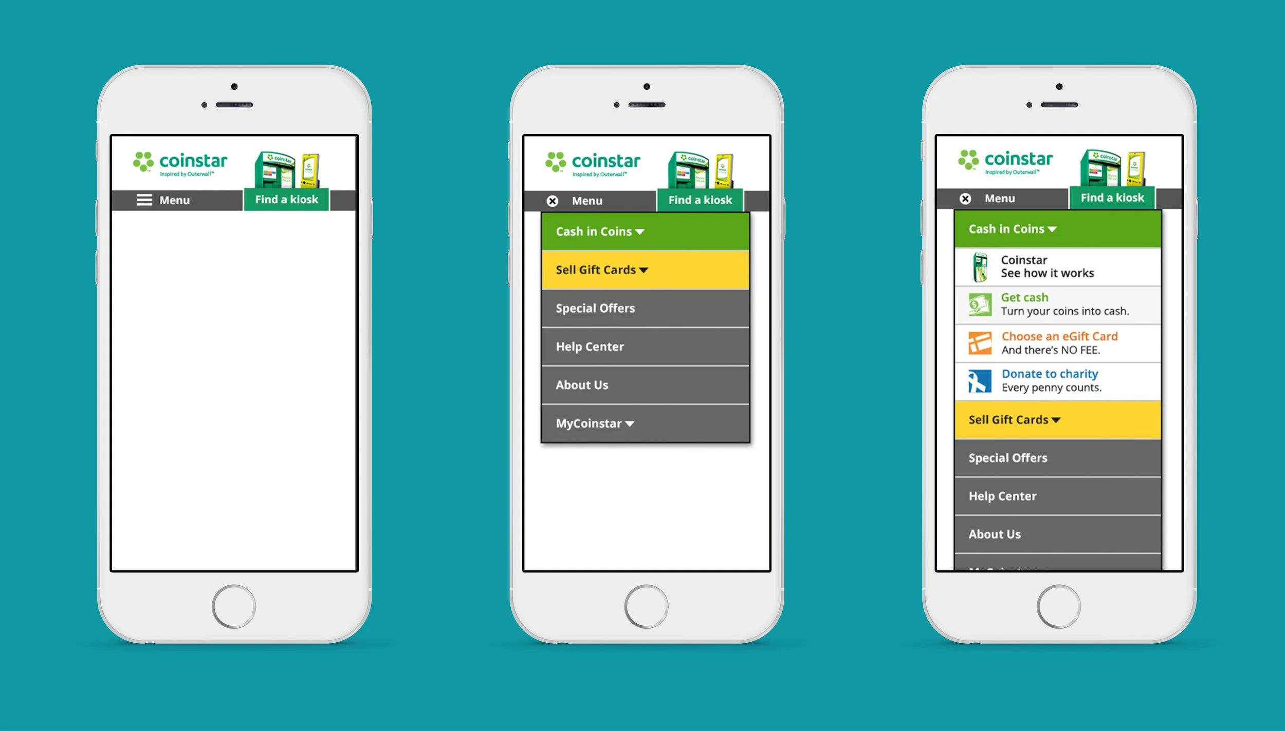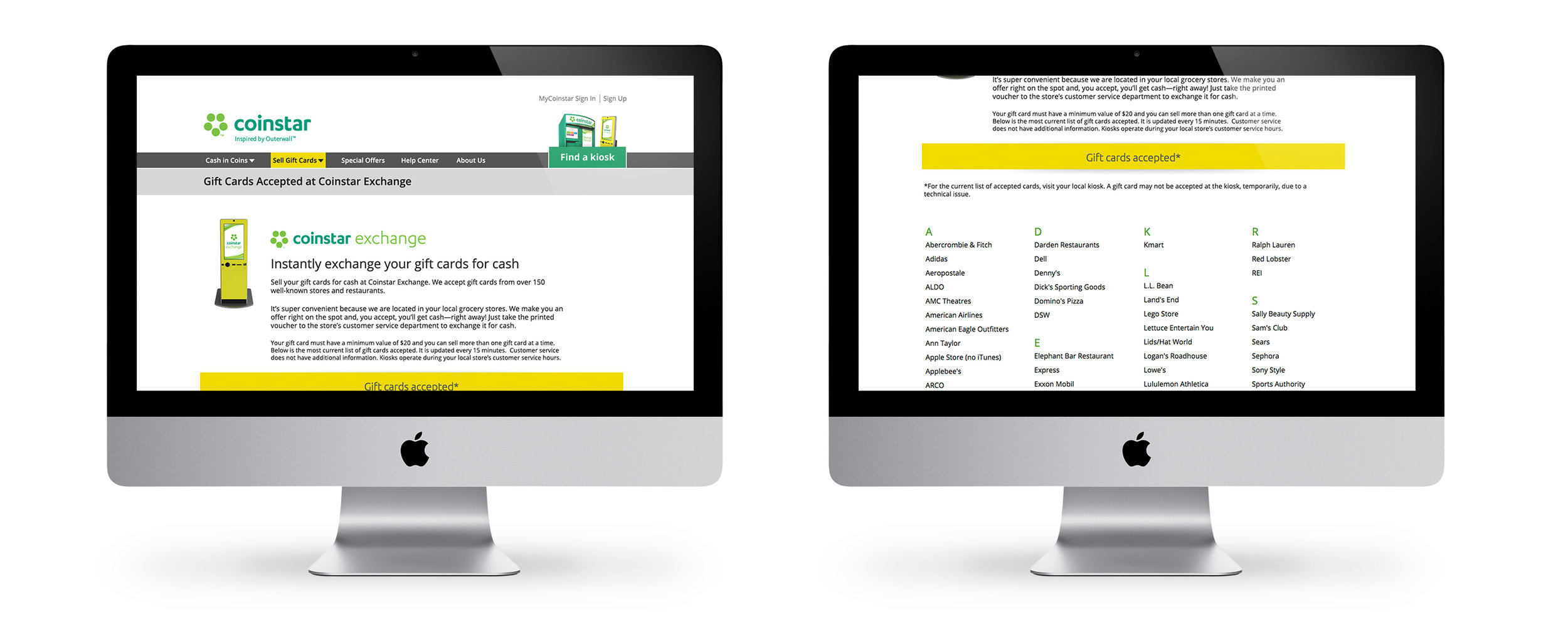
RESPONSIVE SITE
"The new product name is too similar to the core product name and customers are confused"
Coinstar launched a product name Coinstar Exchange, which allow customers to sell their gift cards for cash. The new product was launched on a different kiosk in select locations. Customer Service began to receive calls from customers trying to use Coinstar Exchange but were unable to decipher which of the Coinstar locations had a Coinstar Exchange machine. Some customers drove miles to locations sited on Coinstar.com to only find the original coin counting machine.


Partnered with the Research I lead the develop user scenarios based on Google Analytic and marketing persona research data. Those user scenarios where leveraged to create screeners for user research.


Partnered with Usertesting.com I lead the team in an iterative user research study. Over the course of 4 studies usability improved from a 60% passing score to above 85%. But even with the passing usability scores leadership was unsure on the best navigation and content strategy for the brand and customers moving forward.
To help leadership I conducted an all day content design sprint using wireframes to gather feedback on hierarchy and brand strategy.


After the content sprint the team moved forward with a global navigation approach leveraging branded kiosk image markers to help customers differentiate product information and location results.

Key finding: To differentiate Cointar Exchange from Coinstar service offerings online the page/promotional banners must be marked with the kiosk name, image, and descriptor (i.e coins for cash or cash for gift cards).


